My interest in excess deaths was sparked by noticing what appeared to me to be a prevalence of “medical emergencies” at football matches since the covid-19 pandemic. I have watched a lot of games both live and on Sky over the years and can barely remember any, but on 1st December 2021 Sky reported two on the same day at premier league fixtures and they weren’t the first that season.
In this post I apply business analytics and predictive modelling techniques to weekly death data published by the Office for National Statistics (ONS) to answer the question “how many excess deaths were there during the covid-19 pandemic?” The headline conclusions I have drawn are that:
- The method used by the ONS, which based expected deaths on the average annual number of deaths occurring in the previous 5 years, over-estimated the number of excess deaths occurring during the pandemic (i.e., in 2020 and 2021)
- That there are a significant number of excess deaths continuing to occur since the pandemic (i.e., during 2022 and 2023 year to date)
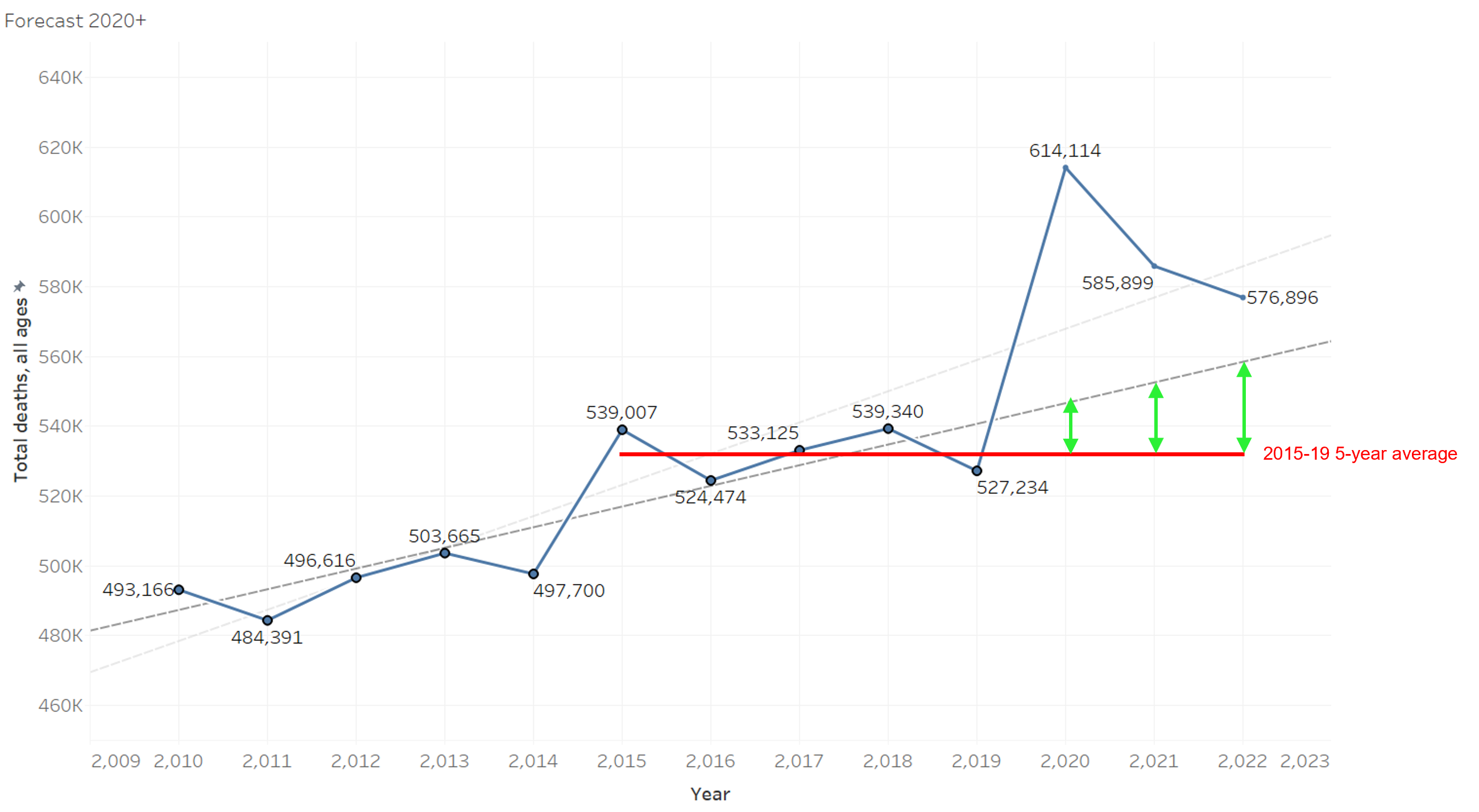
In its monthly mortality analysis for December 2022 the ONS cites the Age Standardised Mortality Rate (ASMR) as being negative for 2022, concluding that mortality rates for 2022 are lower than expected. I find this conclusion mystifying, as in my view the data clearly shows excess deaths occurring in 2022. The chart below explains how these conclusions have been reached.

The blue line shows actual recorded deaths in 2010-2019, the 10 years prior to the pandemic. The grey dashed line is the 10-year trend line for those 10 years (fitted using linear regression) and which is rising. The red horizontal line is the average of deaths over the 5 years prior to the pandemic (2015-19) which shows very little trend.
If we use these trend lines to predict deaths in future years (i.e., 2020-2022), we can see that they will give very different answers – the difference being shown by the green vertical lines. As a result, the number of excess deaths calculated by each trend line (the gaps between the blue line and each trend line) is different.
In my more detailed presentation of the analysis, which can be accessed below, I make referene to 2011 and 2021 census data which shows that over that 10-year period, the population of England and Wales has been both rising and ageing, broadly in line with the rising trend in deaths. I therefore conclude that the 10-year trend line is a better measure of expected deaths than the 5-year average method. The 5-year average is heavily influenced by a high year in 2015 and a low year in 2019, caused by normal fluctuation in the level of winter deaths in those respective years.
It is perhaps worth noting that under both methods, there are still a substantial number of excess deaths compared to what would be predicted in 2022, hence my scepticism regarding the ASMR methodology. At the time of my analysis (based on first 21 weeks), there is some evidence of a continuation of excess deaths in 2023, but due to the inherent variability in the first few months of the year, it is not statistically significant. The pattern will become clearer during the more predictable summer and autumn months – watch this space!
By clicking the image to the right, you can view a more detailed presentation on the findings from the analysis. Note that no warranty is provided in relation to the data used, my analysis or the conclusions drawn.
